As of June 2017, Facebook has already reached its 2-billion monthly users’ mark which also makes it one of the largest marketplaces for internet marketers today. With this social app growing so incredibly quickly, it’s obvious that you should also up your game for your business to strive and ace out the competition.
Aside from a compelling headline and copy, your Facebook ad design is one of your best allies towards a high-yielding advert, and as supported by studies can also help achieve a laser focus audience targeting (pretty handy for such a gargantuan market as Facebook!)
An amazing Facebook ad design serves one purpose: to catch users’ attention while making them desire your product. And to be able to meet this purpose, there are certain design tips you should take advantage of.
In this post, let’s nail down the top 5 design hacks to create amazing Facebook ads.
1. Optimize your ads accordingly
A misplaced ad could result in a truncated copy, hard to read texts and obscured design elements resulting in low clickthrough rate or worse a disapproved ad (hence a waste of money!) thus, it’s important to make sure you optimize your ads accordingly.
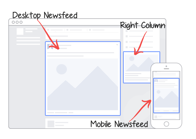
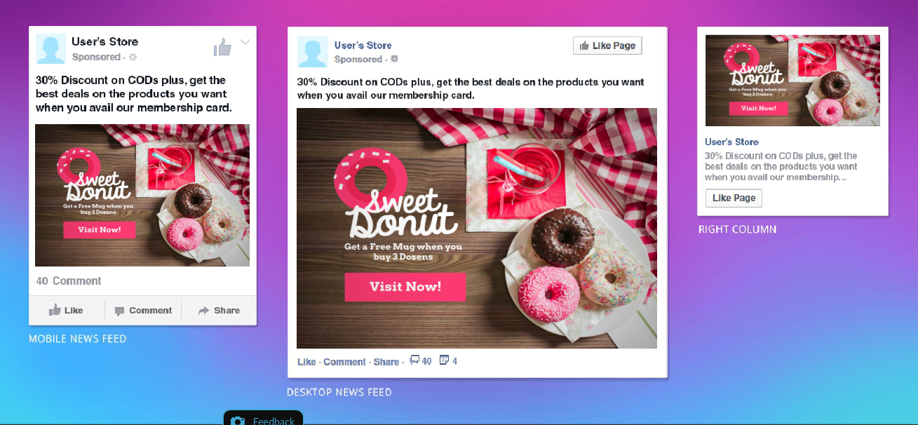
There are three overarching ad placements on Facebook that you should consider before you start creating your ad design – The Desktop Newsfeed, Desktop Right Column and Mobile Newsfeed:
Desktop Newsfeed – This is the most spacious Facebook ad size for images (1,200 x 900 pixels) and is ideal for engagement and generating sales and leads. This supports up to 90 characters. The image can include minimal text.
Right Column – This is the smallest ad size (254 x 133 pixels) but is extremely effective for warm markets as well as when running campaigns with a big reach. Although it also supports up to 90 characters, longer posts might be truncated on smaller screens.
Mobile Newsfeed – Opted for mobile viewing, this placement is 1,200 x 628 pixels. A study conducted shows that if you want to get higher CTRs in the real world, the best way is through mobile advertising. Facebook users tend to click more when using mobile phones compared to desktop.
2. Steal the show with the right image
With a myriad of visuals on your target audience’s news feed (think of the daily pictures of people they care about, dozens of other ads, that colorful and patterned status backgrounds) it’s impossible to steal the show with a mediocre ad design. Take note that every part of your design adds up to a successful ad. Let’s then kick off with the largest part of your design – the ad image.
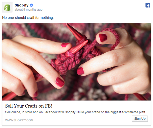
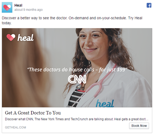
Aim for contrast – Check the contrast between the subject in the image and its background. Images that pop out from its background tend to become more noticeable. Also, you just don’t pick images that have “within-image” contrast. Think about the white and blue Facebook news feed. Images with dark and strong colors such as red, black, yellow and orange could easily catch the attention of a skimming eye.
Use images of faces – Did you know there is a specific part of our brain that responds only to faces? People’s face is the ultimate social tool since it invokes emotion like no other part of the body. This psychology was widely used for commercial products and is proven to be effective such that the packagings of your favorite rice crispies depict human faces.
3. Apply the Psychology of Colours
Ever wonder why Facebook is blue?
Colors have more to it than just making your ad creatives pop in a white and blue news feed.
According to the study on Impact of Color in Marketing, 90% of our quick decisions towards products can be traced back to color alone.
Colors influence consumer’s moods, feelings, brand perception and overall purchasing behavior. This is why choosing the right color for your Facebook ads is vital in leveraging your Facebook marketing strategy.
Studies show that blue is the most favored color for both genders while orange, brown, and yellow are the least popular. If you’re targeting a younger demographic, you can go fancy with bright colors such as red, yellow and orange. On the contrary, older people prefer colors with shorter wave lengths such as green, blue, and purple.
By simply choosing the right colors for your ad design, you can already make it pop and attract, as well as pump up precision for audience targeting.
4. Include a call-to-action
CTA buttons are effective in boosting CTR, engagement, website traffic and conversion.
From the name itself, CTA buttons entail swift action and guide users to your desired action after seeing your ad. CTAs such as “Use App”, “Buy Now”, “Start your free trial”, “Download your copy here”, “Register here”, “Get Access”, are clear and direct instructions for users.
On a research done on the value of CTA buttons in post adverts, it showed that users who clicked on a CTA button are more likely to convert compared to users who clicked elsewhere on the advert.
5. Test multiple designs
A/B testing your Facebook ads is key to knowing which types of ad appeal to your target audience and ones that simply don’t make the cut. Truth is, there is no hidden formula or a magic wand for creating successful Facebook ads. Even the pros who have done tons of ads for a plethora of campaigns agree that you need to test multiple designs to nail down which works for your niche. Doing so will also keep you from wasting capital on ads that don’t convert.
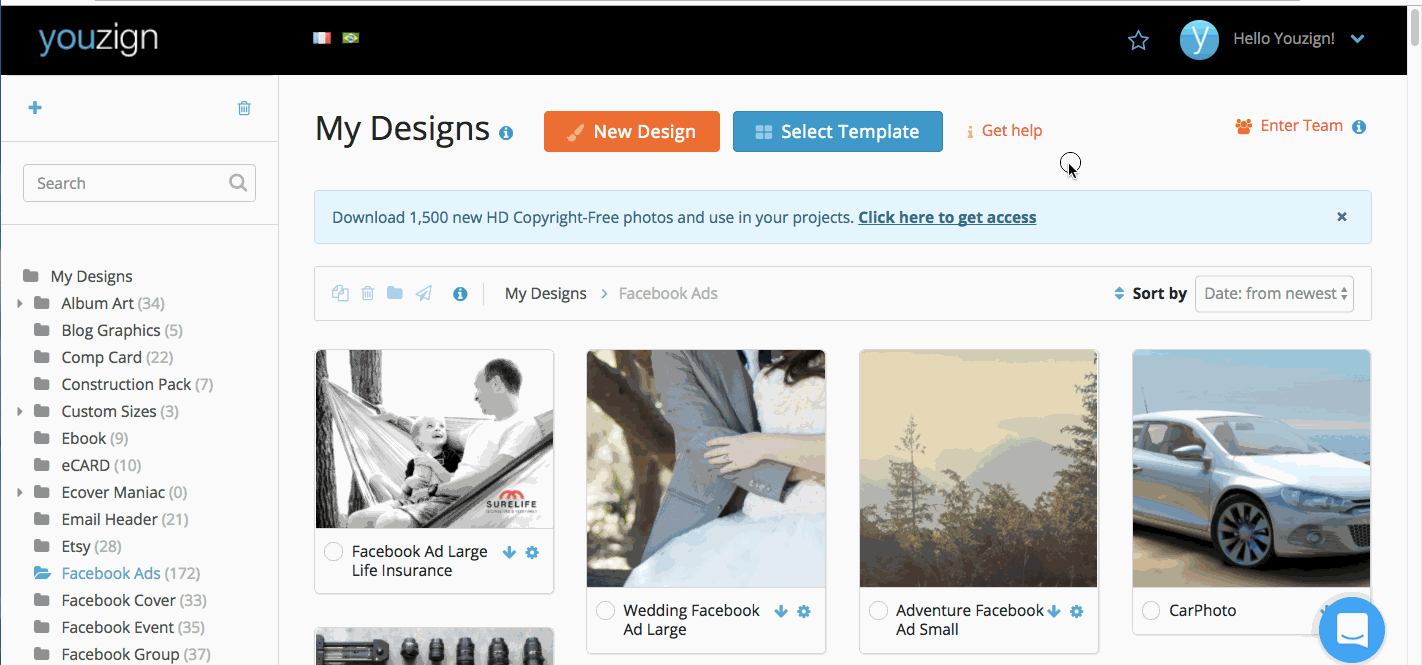
Creating amazing Facebook ad designs don’t have to cost you much time and money. With graphic tools like Youzign, you can create multiple designs in a jiffy for your Facebook campaign. Take a look at these Facebook ad templates available at Youzign. Click on the image below to see more.
With you in mind, we’ve also added a Preview feature for Facebook ads to let you see how your ads look on the actual 3 placements as discussed earlier:
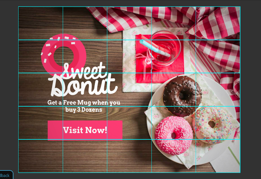
Plus, a handy text overlay tool so you don’t fall away from Facebook’s 20% rule. Ideally, you should only use 5 or fewer blocks because as pointed out by Facebook: if the proportion of text to image is too high, your ads may not reach its full audience.
Over to you!
I hope you find something helpful out of this top 5 design hacks for amazing Facebook ads post!
Like mentioned earlier, there is no exact formula or a magic wand to create a successful Facebook ad design. But following these tips and applying helpful psychology studies will guide you thru achieving success for your Facebook advertising.
So, what Facebook ad campaigns are you working on at the moment? Are there some design tips you’d like to add on this list? Share your thoughts below!
To your success!
P.S. You might want to try Youzign today. We’re currently offering a FREE no-risk trial for 2 weeks! Register here for your free trial account.
Leave a Reply